Hello everybody, I am @lorenzo and in this post I want talk about one of most important topic of graphic design (and not only). I 'm obviously talking about 7 Gestalt Principles. As matter of fact the Gestalt it is also used for the creation of the optical illusions. For those who don’t know it I recommend greater attention. For the next seven days I’m writing a post about it. So let’s start.
The human brain is made to see structure, logic, and patterns and this helps us make sense of the world. In the 1920s a group of German psychologists developed theories around how people perceive the world around them. They called it Gestalt principles.
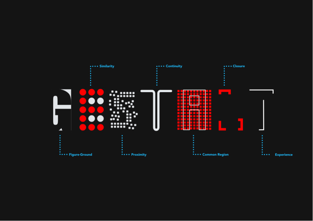
Figure-ground
Similarity
Proximity
Continuity
Common region
Closure
Experience
Today I’m talking about the first principle of Gestalt (it is also my favorite).
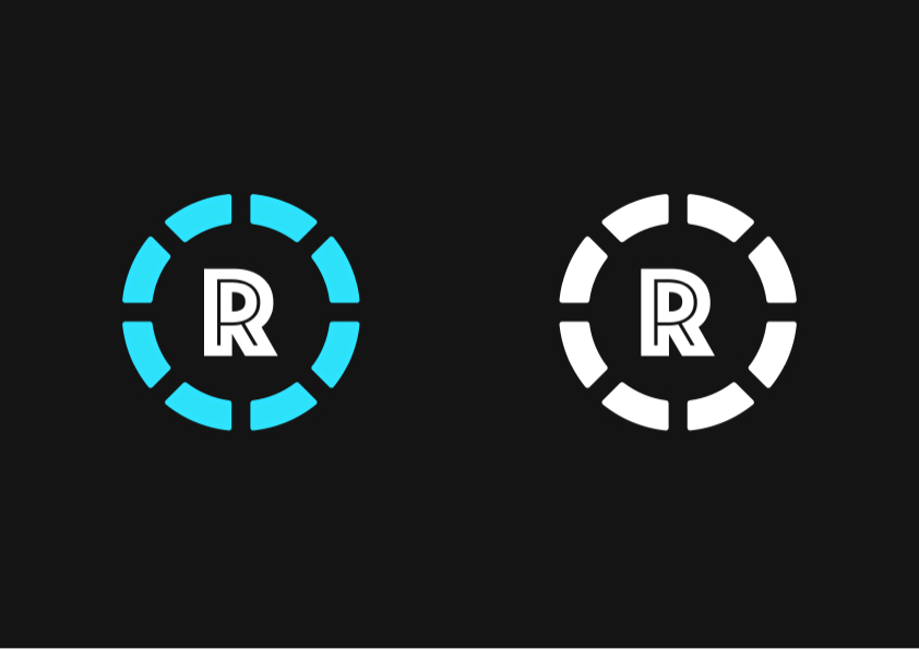
The principle of contrast, also known as the figure-ground, states that objects are perceived as outlines, and therefore figures, in contrast with a background.
The more the figure will have a greater contrast with the background - and with the other elements - the easier it will be to distinguish it.
One of most famous optical illusion: the chalice and the two faces.
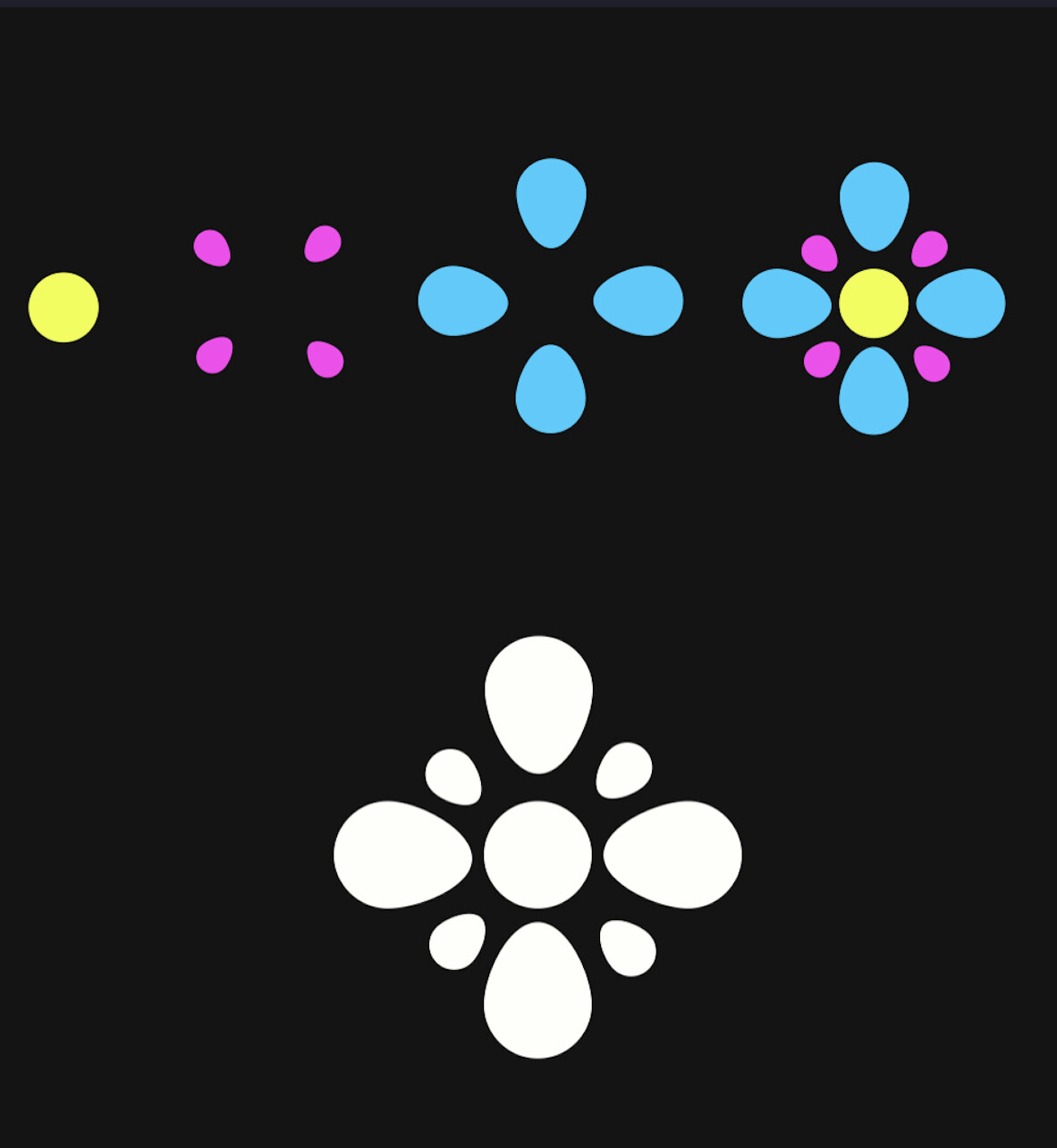
As second day I’m talking about similarity. The principle of similarity states that when things appear to be similar to each other, we group them together. This happened because we think they have the same function. Our brain can group objects for shape, size or color.
An example of flower logo. In this case the pictogram can be monochromatic o colorful. In each ways we can see the four different shapes and and the same time your brain sees it like one shape.
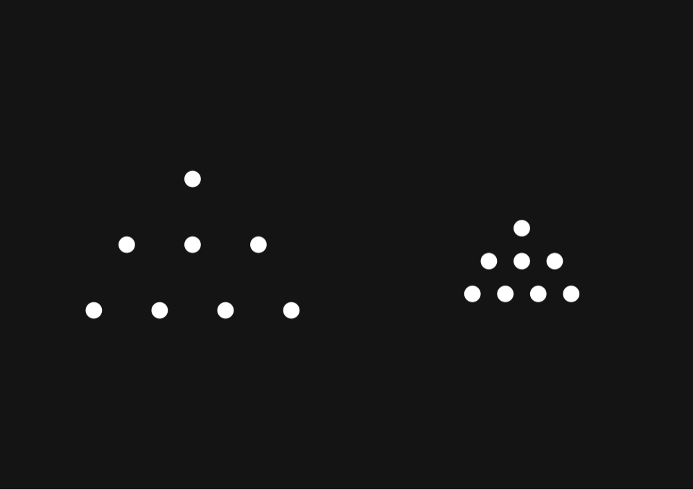
Today I’m talking about the third principle Gestalt: proximity. Proximity states that things that are close together appear to be more related than things that are spaced farther apart. So the space is the key of proximity.
The shape to left seems to represent to three different lines because the horizontal space is twice the vertical space. But when horizontal space becomes like vertical space we perceive one block like the shape to right.
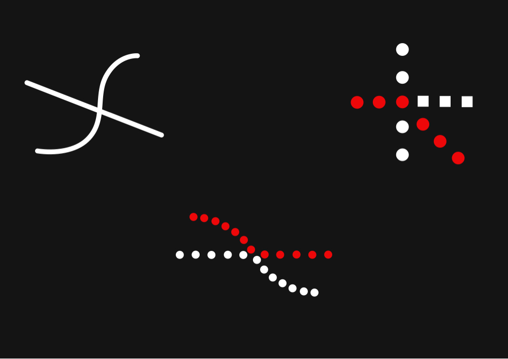
As I announced yesterday, I’m talking about the principle of continuity. It states that elements that are arranged on a line or curve are perceived to be more related than elements not on the line or curve. Our brain need to follow and complete the path. The eye follow every a line.
Our brain connect the vertical rectangles (cyan) like a chain in spite of the spaces between the three blocks and we struggle to follow the horizontal lines because they are separated from the chain (cyan line). So the proximity and the continuity are related.
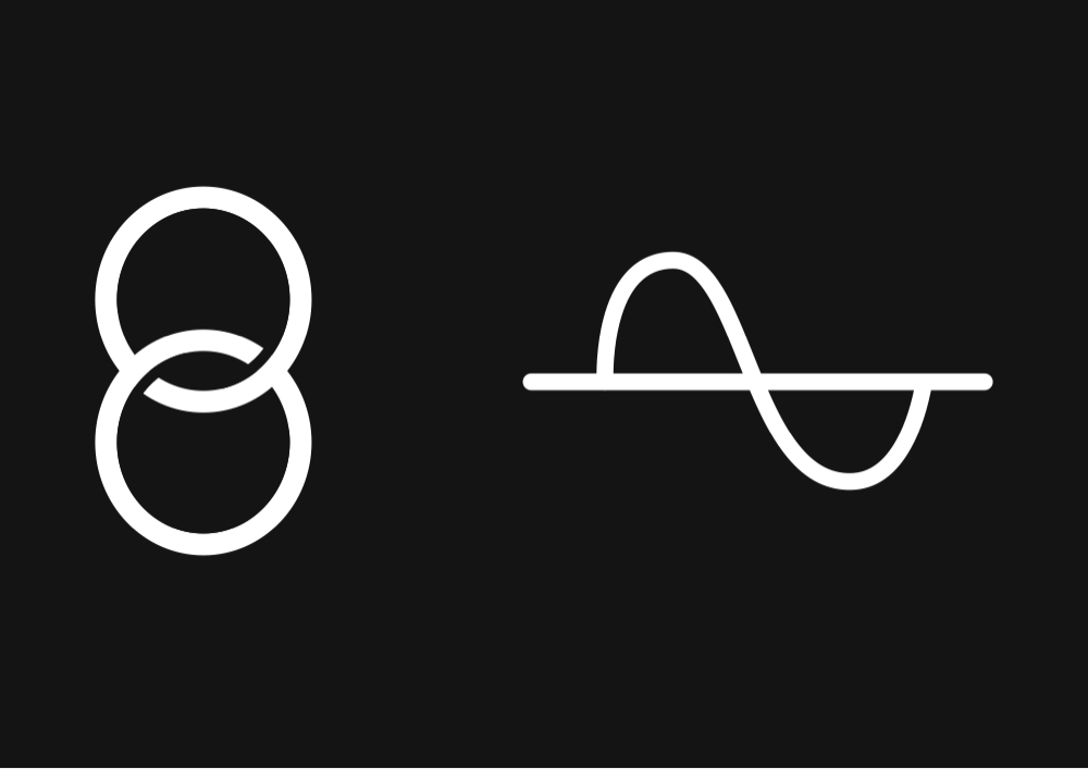
In the first draw we can follow with eyes the lines of 8 despite they are broken. In the second draw we have the opposite situation. The two lines are merged but the power of continuity is so strong that we can differentiate two lines thanks of the them motion.
The principle of common region says that items within a boundary are perceived as a group and
assumed to share some common characteristic or functionality .
We perceive objects located within the same closed region as being grouped together.
The red rectangles border the elements contained in them.
We are nearing the end. The sixth principle of Gestalt is closure. It states that when we look at a complex visual elements, we tend to simplify it in a pattern.
In other words, when we see an image that has missing parts, our brain will fill in the blanks and make a complete image so we can still recognize the design.
In the upper row you can see two examples about geometric shapes. You can recognize them despite they are broken. In the under row you can see two examples where closure it’s applied for the text.
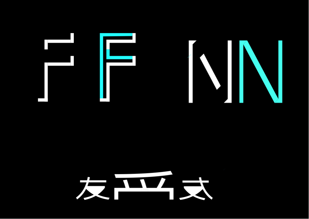
We have come to the end of the week of gestalt principles as last but not the least topic today I’m talking about experience law. It explains that we can throw to use our prior knowledge in order to understand certain elements. In others word we can recognize in a abstract object or picture the primordial shapes imprinted in our brain.
If you know the latin alphabet you can perceive the F and the N. People with a different alphabet can’t see it. In the bottom there is a table with two chairs. Are you sure? Maybe is something else but you don’t know it. Anyway I hid an Esther egg about its meaning.


 (is so cute).

 with the community!